— Reading time: 4 minutes

– My roles: Content Designer and UX Writer –

Challenge

The DesignOps team in Fannie Mae’s Customer Experience Design (CXD) group needed a way to show the value of the work designers did across the company’s four business units.

Most evidence of UX improvements made by CXD’s designers was hidden in emails, decks, and other artifacts that stayed with the product teams.

CXD’s DesignOps team wanted a central place to collect metrics, something they could rely on when pitching engagements to new internal partners.

The DesignOps team chose PowerApps and worked with an in-house developer and one of CXD’s UI designers to create a tool. PowerApps limited the design choices they could make. For example, they couldn’t put field labels above input fields as Blueprint, Fannie Mae’s design system, required.

They tested a beta version with a handful of the Design Managers in CXD who would enter results for their teams’ projects.

The feedback: We have no idea what you’re asking us for here. The language makes no sense.

Project Managers in DesignOps had made a crucial, unfortunately common mistake: they’d chosen to omit a content expert from their project team.

They came to me late in the process, desperate for help with what they thought was a nearly finished MVP release.

I looked at the microcopy in the beta version of their tool and knew we’d have a lot of work to do together to improve the user experience.

And we had to improve it fast. They were a month away from a hard launch deadline set by CXD’s Vice President.

Approach

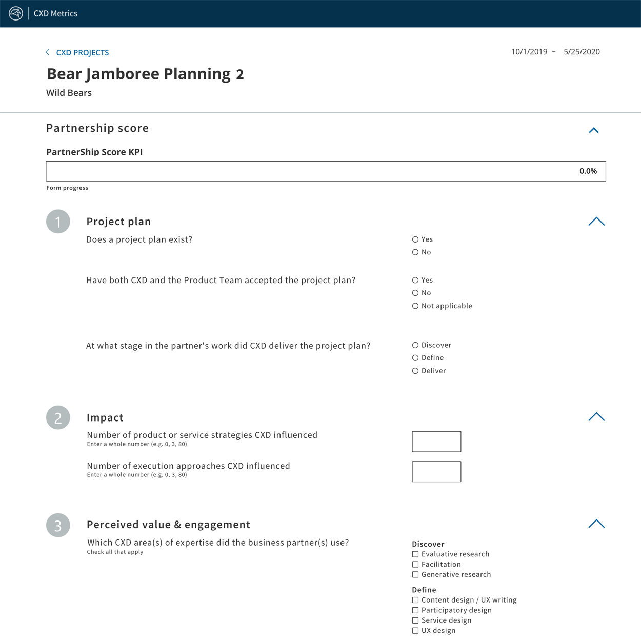
I tested adding a project and entering a Partnership Score, which was the functionality DesignOps wanted to launch as their MVP. I put myself in the mindset of a Design Manager and worked through the tool.

It didn’t take me long to discover why beta testers couldn’t understand what they were being asked to provide in the Partnership Score form.

Most of the labels in the tool were pure jargon. The DesignOps team had provided almost no helper microcopy to guide CXD’s Design Managers as they were filling out the form.

Since their MVP focused on the Partnership Score form, this is where I started.

Plain language Education

The Product Owner in DesignOps was frustrated. The language in the tool made sense to her. She couldn’t understand why her beta testers were having problems.

My first step was to get her to explain each of the sections of the Partnership Score form to me.

In a collaborative session with the Product Owner and the UI Designer, I wrote the current headings on a whiteboard. I asked the Product Owner what information she was trying to get from CXD’s Design Managers in those sections and in each field.

Photo of a white board

This exercise allowed us to eliminate jargon and get to the real meaning and metrics our DesignOps team could use.

It also helped us clarify the language the Product Owner was using with her own team.

We talked about the difference between customers – a business who worked with the Fannie Mae as a whole – and a client or partner – a team inside Fannie Mae that CXD worked with to design or iterate a digital product.

And we talked about why plain language and using a term consistently enabled people to get things done.

This new understanding helped the Product Owner move forward with other parts of her work on the same project.

UX writing and Content Design

Insight into what the Product Owner wanted gave me a roadmap. I wrote new headings and helper microcopy for the tool that would enable Design Managers to:

  • Understand what information they needed to provide
  • The format they should use for the information
  • What to ask their own partners when trying to gather data

The Product Owner wanted the Partnership Score form to capture data from the beginning to the end of a project’s life-cycle. I convinced her to reorder the sections to reflect a logical flow of a project’s timeline.

I also convinced her that the field size and type should match the data she wanted to collect. Following standard patterns would increase usability and reduced the number of times she needed to ask people to provide data in a timely fashion.

Providing these metrics was a new task on their work plans, and most of them were already unhappy about it. The easier we could make it for them to get the data into the system, the less work it would be for the Product Owner in the end.

I used language from the value proposition documents CXD leadership relied on when pitching to partners to clarify and refine the stage labels and services a partner used. Ultimately, this granularity would help DesignOps do strategic forecasting for hiring.

screenshot of web form

Impact

The metrics tool launched on time with field labels and enough helper microcopy to clarify the ask for CXD’s Design Managers.

CXD’s DesignOps team was able to collect the data they needed for their pilot round.

 
I Received a Fannie Mae Bronze Beat Award From the Product Owner for this work
— Reading time: 4 minutes

– My roles: Content Designer and Information Architect –

Challenge

The Blueprint Design System team had launched two releases in their SketchKit library. They’d clarified their rationale for their design language on the system’s website. And they’d provided pages of code for developers.

Yet designers in Fannie Mae’s Customer Experience Design (CXD) group struggled to understand how to use Blueprint’s components. They couldn’t seem to convince their development teams to use Blueprint’s code.

I noticed another set of challenges as I worked with Blueprint’s Product Owner to develop clear processes to govern Blueprint’s intake for new components, and to create a strategic roadmap for the design system’s maturity.

The website had no content strategy. And Blueprint’s documentation ignored the rules and principles in the writing guide I’d developed and pushed to have included in the design system.

I had to do something about Blueprint’s website if the design system wanted to get any traction inside Fannie Mae.

Approach

During interviews with CXD’s designers, I asked about Blueprint’s website.

screenshot of a powerpoint slide Every designer’s response was the equivalent of a verbal shrug. Some designers of the more than dozen we interviewed said they’d never looked at the Blueprint website.

The most common response: I don’t know where to look for what I need.

Behavior patterns & Content analysis

Light analysis of Google Analytics data supported what we heard in interviews. Visitors would bounce among the design language, guidance, and UI-toolkit sections of the site repeatedly before exiting.

I did a content analysis of the documentation on the site to see if the data were right.

I found content in those three sections was often redundant and confusing. Sometimes guidance for how to use a component existed in the design language section; other times it was on the component page.

Pages in the UI-toolkit section contained enough framing content to cause confusion. They were mostly code rendered examples of components and sections where developers could copy the code.

None of the component pages included any connection to the writing guide or the microcopy standards I and CXD’s Sr. UX Content Strategist had been promoting to CXD’s designers.

screenshot of a powerpointI used readability scoring as a starting point. I’d need hard data to convince CXD’s leadership team that improving our documentation would help increase adoption for Blueprint.

Readability on most of the documentation scored way too difficult. This was especially true for component guidance.

Sometimes content stopped in the middle of a sentence then restarted a new sentence. Sentences were long, often end-loaded, and rarely used our own writing best practices.

I knew to improve the site the first thing we had to do was follow our own rules.

IA and content design

The interviews and Google Analytics data convinced me Blueprint’s site needed a new structure. The site also needed a different approach to how we presented content and code for components.

Convincing CXD’s leadership to focus on something besides code and components would be an additional challenge.

screenshot of a powerpointI edited a sample of the text we planned to include on the revised Blueprint site. I wanted to show how applying the plain language, chunking, front-loading, and voice & tone principles included in Blueprint’s writing guide could improve the usability of our own site.

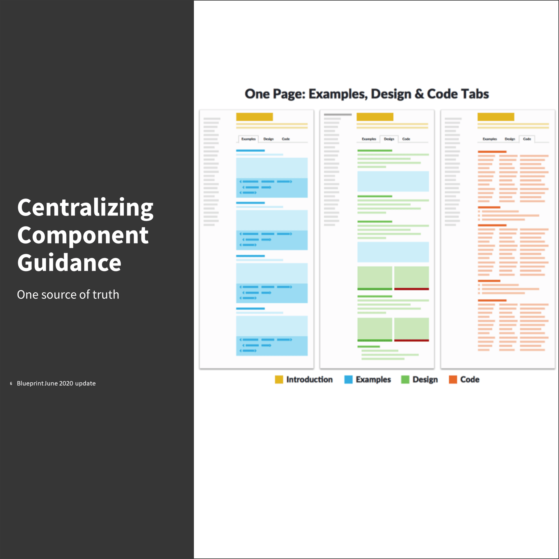
Components and the code that create them are Blueprint’s beating heart. I proposed a centralized approach to each component based on advice from Nathan Curtis.

Including design guidance, code rendered examples, copyable code, and UX writing guidance in a single place would make the component pages useful for 95% of Blueprint’s primary audiences.

screenshot of website

The improved readability and my strategy for centralizing component documentation were enough to convince CXD’s Vice President. She understood that without good documentation, Blueprint wasn’t a design system as much as a disparate set of resources. She approved investing staff time to re-architect and revise Blueprint’s documentation.

I developed a new information architecture with input from a Design System Lead and the Sr. UX Content strategist in CXD.

We weren’t able to get CXD’s leadership to approve tree testing tools because of the lengthy software approval process at Fannie Mae. And we had a deadline of the end of June 2020 for our MVP website release.

We cobbled together a pseudo tree test using Mural. We asked a subset of the designers we’d interviewed to respond to the scenarios.

Our test results were solid enough that we felt we were on the right path. With additional input from Blueprint’s Product Owner, I settled on an IA for our MVP launch date and began revising content.

screenshot of website navgation

A key element of this new labeling was clearly indicating that design guidance and code would live together. “Design & Build” was an elegant solution with high information scent.

Writing the site

I first prioritized the evergreen content on the site. This included Blueprint’s:

  • design language
  • inspirational foundations
  • connections to Fannie Mae’s brand standards
  • commitment to accessibility
  • principles of inclusive design

Much of the content included under design language I split out into the About Blueprint section.

Adding a Get Started section gave designers and developers a practical place to start with usable, basic concepts.

This approach created a clear path through the site for people unfamiliar with design systems. It also let people access the foundational content the original members of the Blueprint team valued.

I developed a process for prioritizing components based on the Google Analytics data and on the Product Owner’s preferences. Button was our first component.

The length, arduous process for software approval at Fannie Mae led the Blueprint team to use the 11ty static site generator as their content management system.

The contractor who had been running DevOps for Blueprint departed in Fall 2019. His approach to including code snippets in pages meant touching content pages when code changed.

As I revised the content on the site, I also systematized how the site was structured on the back-end, separating code into directories and using includes to pull it into documentation pages.

I set up a standard review process on a regular cadence. The Blueprint team worked in three week sprints. After the MVP release of the new site, Blueprint’s Product Owner and I agreed to monthly component documentation releases.

I provided revised documentation in a page priority template format that mirrored the structure on the Blueprint site. This reassured the Product Owner and any other reviewers that for the most part what they saw is what they would get.

Impact

As part of the Blueprint team, I released documentation revisions for nearly a dozen components in less than five months by the end of January 2021.

Designers reported in follow-up interviews that the revised component documentation was easier to understand. It also gave them a central place to send their product developers. Google Analytics reflected these reports showing site visitors had clear paths through the site.

We also saw increased interest in how Blueprint could help their product teams be more efficient from product owners in Fannie Mae’s business units.


— Reading time: 4 minutes

– My role: Lead Content Strategist/Designer –

Challenge

Fannie Mae hired the talent you would expect – visual, UX, interaction, and service designers – when they started their Customer Experience Design (CXD) group.

But they had a gap in their offerings. They had no content experts on the team.

CXD’s senior leadership generally understood the value of content as a design discipline. They didn’t see a practical place for it in the group until the FannieMae.com redesign project was about to launch.

Finding a solution for that single project was simple: hire a content strategist. That’s how I joined CXD in 2018.

The bigger challenge they faced: how to include content strategy and design as part of their offerings?

As I  took part in critique sessions and project spotlight events, I saw that CXD’s designers needed a better understanding of the value content experts could bring to projects. They thought that content was something you just added at the last minute instead of a key part of designing a product and creating the user experience.

This gap in understanding played out repeatedly. Designers asked for content help – just “look it over” – in products close to launch dates.

This put me and the content strategist hired after me in a position where we were offering little value. Design decisions were in code and ready to go. If content wasn’t right, it meant rework, which product owners and teams didn’t like.

This pattern had to stop.

Fannie Mae’s tech-first mindset meant designers would need enough content maturity to be able to advocate for content with their product owners and product teams.

When CXD’s leadership stood up communities of practice (COPs) in 2018, I found my first way to raise the group’s content maturity.

The second path to increasing content maturity at Fannie Mae wouldn’t present itself until mid-2020.

Approach

Designers and leadership in the Customer Experience Design (CXD) group used the term content strategy as a catch-all. It meant everything from Information Architecture to UX writing to product content strategy to storytelling.

screenshot of presentation showing design thinking process

I resisted the temptation to dig into terms as I planned COP events. Instead, I presented content in a context they would understand.

I concentrated on the ways a content expert could add value to the design process and help improve the UX for customers.

I showed designers how they could avoid rework by getting content experts involved early. Once they understood, my next step was empower CXD’s designers to be advocates for content.

Mentoring a design group

The scope of work the CXD group handled was vast. It was too much for a now three-person content team to handle in mid-2019.

The number of requests we got – from proofing presentation deck copy to designing product content strategy to UX writing to storytelling help – overwhelmed us.

We needed designers to be more than advocates.

They had to have enough knowledge to know when they could make their own improvements and when they needed help.

Community of Practice as a vehicle

While most communities of practice are for practitioners, this one needed be useful for designers whose primary focus wasn’t content.

I set up an editorial calendar for the Content Community of Practice partnering with the Sr. Digital Content Strategist hired full time in 2019.

We focused on hosting events that:

  • mentored CXD’s designers in content best practices
  • gave them practical techniques they could apply with their product teams

The goal: to raise CXD’s overall level of content maturity.

CXD’s content team reduced to two in late-2019 as one of our content strategists, still on contract, moved on to an in-house opportunity. This made it tough to keep momentum going in the community of practice.

Ultimately, we presented 10 1-hour sessions in 2019 in a monthly cadence on topics such as:

  • how to design error messages (based on techniques from Writing is Designing by Michael J. Metts and Andy Welfle)
  • understanding plain language and how to recognize jargon
  • being user centered with content and how designers can incorporate structure into their work with content (based on techniques from Writing for Designers by Scott Kubie)

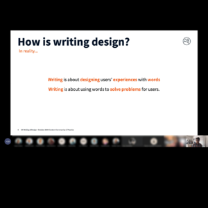
Mindsets - Spoiler alert: You need both Writing mindset asks: How many words will fit here? How should I describe this action? What terms are we using elsewhere? Design mindset asks: What terms do our users know and use? What happens next? What problem are we really trying to solve?Once we had practice delivering on our editorial calendar, it was time to find other content experts in the Enterprise.

Because CXD was part of Fannie Mae’s single-family division, I reached out to a Sr. Writer in the company’s marketing & communications division. I asked her to promote the COP events and encourage her coworkers, who were writers and communications professionals, to attend.

In January 2020, I planned an ambitious program for the content COP. It included a two-part workshop on storytelling and presenting design work to stakeholders, and UX writing practice sessions, among other events.

Then the pandemic arrived.

Shifting to fully remote work launched Fannie Mae’s meeting culture into overdrive. It doubled, and for some people tripled, the number of hours of meetings every week.

Everyone had meeting fatigue. And no one wanted to attend an optional community of practice for something that wasn’t their specialty.

We needed to do something different in 2020 to keep people interested.screenshot of presentation

From May 2020 through October 2020, we held monthly 30-minute sessions. These mini sessions gave bite sized techniques on topics designers faced daily:

  • how stories relate to design and how to tell better ones to get stakeholder support
  • what makes a good call to action
  • designing errors states – round 2 (CXD had more than doubled in size in 2020 and most designers hadn’t taken this training)
  • the impact of word choice on the user experience
  • how microcopy can help or hinder someone doing a task

I tied each of these sessions into a UX principle. My storytelling presentation, for example, used Miller’s Law and the concept of working memory as its hook.

We also provided resources they could dig into later to learn more.

Our most popular topic in 2020: how stories relate to design and how to tell better ones.

We shortened this presentation from our in-person plans. And we had a guest presenter show us her process for building one of the most popular quarterly readouts in CXD’s history.

Impact

Community of practice meetings in 2020 drew an average attendance of 40 people, at least one-third of those from Fannie Mae’s marketing & communications division.

My strategy and the content I designed and mentored CXD’s other full-time content expert to create increased attendance for this community of practice 225% in just two years.

We earned a Net Promoter Score (NPS) of 96 in 2020 as rated by CXD’s designers and people in marketing & communications.

— Reading time: 3 minutes

– My roleS: Content and UX strategist –

Challenge

The Blueprint Design System team had been working on the nuts and bolts for over a year. They’d designed components, the system’s visual language, and code. They had a solid first release.

They were also overwhelmed.

The team lacked a strategic plan for maturing Blueprint based on designers’ daily needs.

Designers were reluctant to use the system, instead recreating components project by project.

I knew the Blueprint team needed structure and clear communication to build trust among designers.

Approach

I worked with Blueprint’s Product Owner and a Design System Lead to understand the maturity of the system’s:

  • code
  • visual design assets (as expressed in a packaged Sketch library)
  • documentation
  • intake process for adding components

We used design thinking methods like What’s on your radar? and the Importance/Difficulty Matrix to expose information and the vision held by the Product Owner.

His ideas Blueprint’s potential for impact needed to be systematized into a plan.

We worked together to get consensus on where the team could make updates, focusing on immediate impact. And we wanted to understand longer term strategic challenges.

Understanding Users

digtal empthy map

The Design Lead and I interviewed designers in Fannie Mae’s Customer Experience Design (CXD) group.

We discovered a major gap in designers’ understanding of Blueprint’s purpose and their role in the system.

Designers saw Blueprint as one more roadblock to interacting with their product teams.

Inconsistent release schedules and lack of insight into the Blueprint team’s work created distrust.

Our key takeaway: The Blueprint team’s plans needed to tell the story of the design system’s value clearly.

Drilling down to governance

We focused how the Blueprint team’s tactical work contributed to the strategic whys of a mature design system. Expressed as themes, we could tie advancing the design system to partners’ priorities for Fannie Mae.

text on a whiteboard

We also hooked each theme to CXD’s internal goals.

We hoped this would clarify the ways in which Blueprint was more than just a enabler of implementation teams.

We wanted leadership to understand Blueprint could be a vehicle for changing the design culture inside both CXD and Fannie Mae.

Based on the theory that ownership creates investment, we wanted to find a way to involve designers directly in Blueprint while still maintaining quality.
We developed an intake process that juggled speed, quality standards, and real-world needs. We could not sacrifice any of them as Blueprint took on new component suggestions from product teams.


We saw being able to communicate this process with details as vital to rebuilding trust in the design system with CXD’s designers.

Strategic Plan

We tackled the design system maturity roadmap next.

Our point of view: tactical implementation was fine. Without an idea of long-term impact, senior leadership would still view the design system as a risk.

paper and stickie notes

Several days and many pads of stickies later, we had an idea of how to communicate our vision for maturing the design system

I translated these intensive sessions into a Mural-based based presentation.

This level of detail – strong in the now and more fuzzy as we looked to the future – allowed us to tailor the presentation of this complex plan our audience’s attention span.

The goal was to convince CXD’s leadership team – three design directors, an operations director, and vice president – to allow designers to actively participate in co-creating the Blueprint Design System.

We also wanted to demonstrate the team understood this wasn’t just a design exercise: Blueprint needed to show real value for the enterprise.

Results

Our senior leadership endorsed the phased maturity plan.

They embraced the idea that “now” is more certain and the future would come into view as we grew understanding, adoption, and usage across the enterprise.

They provided feedback that we focus on measurable impacts (e.g. staff hours saved) as a criterion for moving Blueprint from one phase to the next instead of on time as the deciding factor.

The leadership team praised our intentions and spirit of the approach.

CXD faced funding and financial pressures that prevented designers from devoting even 1-2 hours per week to co-creating the design system.

Maturing the design system was left to a small core team primarily focused on tactical delivery.

I was a member of that core team from mid-2019 through March 2021. We were able gain wider adoption with business unit partners by:

  • improving Blueprint’s documentation
  • designing and delivering training to educate on the importance of UX, content design best practices, and how Blueprint could save them time and money


— Reading time: 3 minutes

– My roles: Copywriter + Project Manager –

Challenge

The St. Clair Inn was almost ready to launch. The grounds were groomed. The rooms were ready. The staff was in place. Their soft opening party approached fast. But they had a problem.

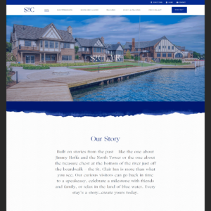
Their beautiful website had no content.

No site content meant no ability to promote the Inn to St. Clair locals or the guests they hoped to attract.

They needed help, and they needed it fast.

Approach

I met initially with the Inn’s Executive Director via video call to define the minimum viable product for the site’s content.

Because all the facilities at the Inn wouldn’t be open for the soft launch, the Executive Director felt that the site could get by with a small amount of content for the landing pages.

I encouraged her to think strategically. I convinced her that even though the site seemed huge, it made sense to write blurbs for all the facilities, particularly the restaurants and bars. That way, as the Inn opened in phases, she would have the content when she needed it.

screenshot of website

She agreed the approach was to publish the blurbs for each facility but remove the calls to action for the ones that wouldn’t be available by the Inn’s soft launch.

I knew after that initial meeting I would need help. I contracted with a talented UX Writer to help me write the Inn’s story.

We met with the Executive Director to:

  • understand the St. Clair Inn brand, including the voice and the tone the Executive Director wanted
  • explain our shared approach to plain language
  • establish a working agreement for how the Executive Director would get content, provide feedback, and on what turn around time

Even with the short timeline, the UX Writer and I felt at least one round of edits would be necessary. We understood the importance of getting the voice and tone for this copy right.

I suggested, and the UX Writer and the Executive Director agreed, that the simplest method would be to use a shared Dropbox folder and Microsoft Word and Excel because they were tools we were all comfortable with.  We would provide copy in Word. The Executive Director would provide comments the same way.

The Executive Director gave us the photos that the Inn’s web firm was still working to get into the site. They would help us get a better sense of the tone she wanted for the copy.

She also gave us credentials for the  development version of the site so I and the UX Writer could understand how much space we had for copy.

Dividing the work

I split the site up with the UX Writer based on interest and experience.

The writer chose to write the accommodations descriptions. As an experienced traveler, she felt she knew what would appeal to the guests the Executive Director wanted to attract. The writer also took on the calls to action across the site.

I wanted to write  the dining and events content based on my own experiences as a leisure traveler.

I also worked with the Executive Director to create an events request form that would give the Inn’s Event Planner needed information while affirming the Inn’s non-discrimination policies.

Racing the clock

We had less than two weeks to provide the copy for the site. screenshot of spreadsheet

We had to give the Executive Director enough time to get the copy into the site’s content management system before the Inn’s soft launch party.

I  took on the role of project manager. I knew because of the short timeline the project’s success depended heavily on us being organized.

I created a comprehensive tracking sheet in Excel saved to our shared Dropbox folder. 

This gave the Executive Director clarity and security. She could see the status of the copy for each section of the site at any time. She could also see if she had any approval tasks due back to us.

Results

We completed the copy in the voice and tone the Executive Director wanted in eight calendar days. The Executive Director had plenty of time work with her web firm.

The St. Clair Inn site was up with content that tells the Inn’s story – from the luxury accommodations to the seven restaurants and the bar to the event options – a full week before the Inn’s scheduled soft launch party.

Praise from the client

It was vital that we have our site up before our soft opening and we were running out of time to get the content done. Anne’s calm, focused approach helped me clarify the tone I wanted for the site and how I wanted to promote the Inn.

Her attention to detail and process reassured me we could get the work done on time. She delivered exactly what I needed, when I needed it, while managing another writer to make sure the content was consistent from section to section. Her work enabled us to have our event as planned and set the mood for the Inn.

– Aimee Lawrence, Executive Director, St. Clair Inn

— Reading time: 5 minutes

– My roles: Content designer and information architect –

Challenge

The content management system (CMS) powering FannieMae.com was obsolete. The software vendor would stop all support, including security updates, in mid-2019.

Fannie Mae needed to do a massive website build in a hurry. 

They would have to migrate decades’ worth of content. Because their site’s look didn’t fit with newly launched brand guidelines, they also needed to do a visual redesign. 

And they had to do all this work across four business units with vastly different audiences.

When I joined this project as Lead Content Designer, Fannie Mae had already picked Drupal as their platform. They also had an implementation partner, Phase2 Technology.

Figuring out what each business unit needed, prioritizing the work, and convincing a risk-averse organization to embrace modern design principles in the middle of a huge technology project would be a project by itself.

Added to all that was the challenge of making sure that the site’s IA and its content enabled Fannie Mae’s customers to get things done.

Approach

I partnered with the Phase2 team to discover stakeholders’ needs in each of the business units. In the discovery phase, I represented the Customer Experience Design group’s perspective on UX.

Business goals and audience needs

Several weeks of interviews with internal stakeholders revealed different audience needs and concerns. Some of those insights included:

  • Single-Family had a large customer base who interacts with Fannie Mae using web-based self-service or through a structured customer support team
  • Multifamily’s customer base was much smaller and works directly with Fannie Mae staff
  • Customers in Capital Markets prioritized time and efficiency
  • Visitors looking for information about the company’s health, earnings, and governance needed clear paths through the site

The Executive Steering Committee  in charge of the project prioritized the Multifamily section of the site. They thought there was a lower barrier to integrating Drupal with Fannie Mae software applications in this business unit.

Multifamily’s site would be an excellent test: Could the Fannie Mae team and Phase2 team succeed together.

New IA for improved discoverability

I had a theory from my initial review of FannieMae.com’s menus and site structure. I did several things to find out if I was on the right track.

Fannie Mae’s policies prevented us from interviewing customers. Instead, I used Google Analytics to see if there were any user behavior patterns. I found users were moving between pages rapidly, often going back to the same section on the site multiple times before exiting.

I also did  a content focused heuristic evaluation on the whole Fannie Mae site.

screenshot of a spreadsheet

This evaluation had 61 criteria grouped into 10 categories. I based these questions and categories on work by Abby Covert included in The Content Strategy Toolkit written by Meghan Casey.

Because Fannie Mae is a data driven organization, I created a custom scoring system to quantify these subjective questions to internal stakeholders.

I ranked each item on a scale from 0 to 3:

0 = Fails this evaluation criterion

1 = Needs significant improvement to meet this evaluation criterion

2 = Meets this evaluation criterion but could be improved

3 = Meets this evaluation criterion and does not need improvement

As part of this heuristic evaluation, I tested readability and accessibility on a sample of the pages from each section on Fannie Mae’s site.

The content heuristic plus the GA data proved my theory.

The menu labels on Fannie Mae’s site had a low information scent.

screenshot of website navigation menus

Telling the difference between menu items required a lot of work for site visitors because they were almost identical from section to section. They also used terms that for customers new to the mortgage industry bordered on nonsensical jargon.

I needed to improve this labeling to reduce confusion and get people to the information they needed.

To get to the right navigation for Multifamily, I facilitated workshops with stakeholders. We collaborated through three rounds on grouping the content, and on how to label those groups. I strove to find a solution that would satisfy internal stakeholders and serve experienced and novice customers alike.

Ultimately, we raised the information scent by using a plain language approach. We chose labels that would help visitors better understand what content is in each section.

screenshot of website navigation

To increase the connection between the site’s sections during this multi-year project, I proposed unifying navigation mirroring navigation on the existing site.

This meta nav bar would live above each section’s navigation to orient site visitors. It showed a hierarchy among the sections. And the two sets of navigation gave visitors easy access to both Multifamily information and the rest of the Fannie Mae site.

Designing content types

A new architecture required new content types for the Aquia Drupal system Phase2 was building for Fannie Mae.

Because each business unit would have unique needs, I and the content strategist from Phase2 recognized the most efficient way to build the system was to use taxonomy on common content types.

Both Phase 2’s content strategist and I tried to convince internal stakeholders to develop and apply some governance rules to the content migration. Unfortunately, the Project Owner felt it would be better to migrate everything and sort it out later.

This meant that Phase2 needed a way to map the decades of content they would migrate out of Fannie Mae’s obsolete content management system.

screenshot of website

We had to make sure we captured everything in the right places.

Defining the specific fields for each content type included the:

  • Drupal field name
  • Field Label
  • Field supporting text (i.e. UX microcopy to guide content managers)
  • Required status
  • Type of content allowed in the field
  • Implementation notes (e.g. limit field to 60 characters)

These definitions provided a road map for Phase2’s development team to build these custom content types.

Applying UX writing best practices to the field labels and field supporting text improved the UX for the content managers at Fannie Mae.

I collaborated with the content strategist from Phase2, a CXD visual designer, and a CXD UX strategist to create landing pages for the top level nav items and how they would work with the content types.  I created and refined the content type definitions and the taxonomies as requirements shifted and changed.

Our modular approach to content types created flexibility when it came to the content strategy for each landing page.

Easing reading

I tested readability on Fannie Mae’s public web content as part of my quantitative evaluation.

Controversial as it can be, readability scores gave the team responsible for the content a place to start with improving the user experience.

screenshot of a powerpoint slide with grade level score of 23, education level of grad, and reading ease score of extremely difficult for the multifamily section of fanniemae.com

I used these readability scores to convince content owners to embrace writing for usability best practices.

I created a custom training for them that over the next two years I would iterate into a training for CXD’s Design Academy.

Impact

The redesigned version of Fannie Mae’s Multifamily website launched in July 2019.

Customer account reps in Multifamily reported an immediate decrease in the number of calls that included requests for information now easily found on the site.

Centralizing this information in one place improved governance for content owners who had been maintaining a separate directory so they could easily find documents outside the website. The cascade effect improved content governance for Fannie Mae as a whole. This meant the website became the source of truth for Multifamily’s information.

After taking the writing for usability training I custom designed for them, Multifamily content owners were able to reduce the average grade level on revised content from a grade 23 to a grade 8 educational equivalent.
 

— Reading time: 2 minutes

– MY ROLES: CONTENT STRATEGIST, PROJECT MANAGER, DRUPAL DEVELOPER –

CHALLENGE

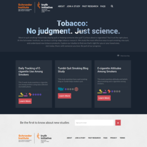
The Schroeder Institute needed a way to support their other channels and help people find and enroll in quit smoking studies.

APPROACH

The first step was to create stakeholder interview questions to get information like:

  • internal goals and objectives
  • target audiences
  • top tasks for audience members
  • desired perception of the organization
  • visual design preferences and dislikes

ORGANIZING THE SITE

I did competitive research, which confirmed the IA Schroeder’s in-house team thought would be most useful to potential study participants.

Next, I developed custom taxonomies covering:

  • study principals
  • types of studies
  • audience characteristics

These taxonomies would be the key to funneling participants to the correct studies early in the process.

DEVELOPING THE SITE

I developed the Drupal 7 site creating:

  • content types
  • fields
  • contexts and other back-end elements

These matched the needs discovered in the first phase of Rad Campaign’s waterfall project management process.

I led Rad Campaign staff through design review on wireframes and first round visual comps.

I also acted as a buffer between the in-house designer and Schroeder Institute staff. Part of my role was to translate the client’s feedback into understandable change requests for Rad Campaign’s design partner.

With desktop, tablet, and mobile comps approved, I finished back-end development and started on a custom theme.

The audience for study enrollment would need the site to work on mobile and tablet.

I started with Bootstrap to leverage its built-in mobile capabilities. This would set me up to deliver the best user experience to the site’s audience.

DELIVERABLES

As sole developer and project manager for this project, my deliverables included:

  • stakeholder interview documentation
  • competitive research analysis
  • project timeline with milestones, including internal review for deliverables due to the client
  • sitemap and navigation schema that accounted for recommendations from an SEO consultant
  • functional requirements document, which was the road map for back-end development
  • back-end Drupal customization including module installation, creation of views, contexts, taxonomies, and content types
  • graphic assets optimized for multiple platforms
  • custom SASS creating the interactive UI and custom theme based on Bootstrap

I created and delivered to Schroeder Institute staff basic training on content entry, publication, and management. I also created and delivered an advanced training on technical site management for Drupal.

IMPACT

The Schroeder Institute tobacco study enrollment portal had good SEO placement, often appearing in the top 10 results for searches via Google, DuckDuckGo, and Bing.

— Reading time: < 1 minute

– My roles: Content strategist, IA, and Front-end WordPress Developer –

Challenge

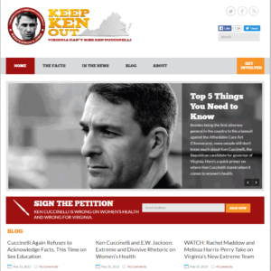
When the Planned Parenthood Action Fund (PPAF) decided to oppose Ken Cuccinelli’s 2013 bid to become governor of Virginia, they came to Rad Campaign with a timeline of three weeks to launch a site.

That included all discovery, IA, design, content generation, and development work.

Approach

The team at Rad Campaign agreed the best solution would be to modify an existing WordPress theme in tandem with PPAF’s staff creating content for the site.

I helped surface PPAF’s desire to:

  • highlight active traditional and social media campaigns
  • keep content available on the homepage regardless of type

I determined the IA needed a small number of top level items to hold depth of content in each category. 

The navigation also needed to include a single page fact sheet and a donation button.

Deliverables

Ultimate deliverables included:

  • WordPress templates customized to the desired layout
  • custom Content Types
  • custom CSS to align the look and feel with PPAF’s needs
  • additional image styles
  • plugin installation

IMpact

PPAF helped defeat Ken Cuccinelli’s bid to be Governor of Virginia in 2013.
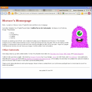
KeepKenOut.org launched in February 2013. PPAF redirected the domain to their Women Are Watching site in December 2014.

— Reading time: 2 minutes

– My roles: Content Strategist, IA, Trainer, Front-end Developer –

Challenge

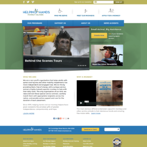
The Monkey Helpers project was already in progress when I joined Rad Campaign.

I used my skills as a content strategist and information architect to understand the organization’s needs.

It turned out that they had content needs and technical needs that hadn’t come to light yet.

Approach

Rad Campaign’s waterfall process and deliverables were unfamiliar to the stakeholders at Monkey Helpers; this meant they needed close guidance.

I evaluated the site structure Monkey Helpers’ Director of Development and Sr. Development & Communications Associate had proposed to Rad Campaign staff.

I created a site map and other artifacts to help them visualize changes I suggested to the IA.

I translated this structure into a functional requirements document. I would use this guide for back-end Drupal development, creating content types, fields, and custom Drupal views.

My dual roles as Developer and Project Manager let me guide Monkey Helpers stakeholders through the project on a 1:1 basis. This meant we could evaluate any of their changes requests faster. 

Rad Campaign was better able to manage the project’s scope, and Monkey Helpers better understood the impact of changes on cost.

Content strategy

 Content Strategy and editorial calendars also came into play for the first time for Monkey Helpers during this redesign.

Their previous content strategy gave “about us” content prime placement on the site’s homepage, creating a stale, inactive presence.

I developed a content strategy for Monkey Helpers that enabled them to highlight recent achievements. It got them to think about how to tell the organization’s story using recent events updates and more appealing evergreen content.

I also helped them develop an editorial calendar and guidance for archiving posts that were out of date.

Custom training

Drupal was a new system for the stakeholders at Monkey helpers. I created and delivered several basic and advanced site management trainings for staff responsible for site upkeep. We held these trainings in a series during the site’s development and after launch.

Deliverables

Rad Campaign’s practice at this time was to use Omega as a base for all custom Drupal themes. I used Omega to create:

  • a subtheme
  • custom deltas
  • contexts
  • views
  • callouts
  • CSS

I continued to be the primary point of contact for Monkey Helpers for maintenance during my four years at Rad Campaign. This work included:

  • Drupal core and module security updates
  • adding SSL to the site
  • implementing functionality to support year-end giving pop-up asks and training development staff on the technology
  • incorporating functionality for donations when Monkey Helpers switched eCRM providers

When Monkey Helpers engaged Rad Campaign in 2012, it was the firm’s policy to develop responsive websites as an additional-fee add-on to a contract. At the time of signing and while I was at Rad Campaign, Monkey Helpers declined to move forward with responsive site development.

Impact

Monkey Helpers staff could self-service content updates instead of being at the mercy of a web vendor.

This better positioned the organization to serve their potential clients. And it enabled them to have better control over their ability to raise funds for programmatic work.

— Reading time: < 1 minute

– My roles: Course designer + Trainer –

Challenge

Web content managers in the Digital Content Division (DCD) at HHS lacked HTML and CSS skills.

This made them dependent on a contractor-based team for even the most basic updates to HHS owned websites.

This slowed response time for internal customers creating a reputation that the division was unresponsive.

Approach

I proposed a plan to DCD’s Director: I would create and deliver basic HTML and CSS training tailored to tasks content managers faced daily.

I examined HHS’s content management system (CMS) looking for tools to structure documents and apply styles.

I interviewed content managers to learn:

  • what caused them the most difficulties when interacting with the system
  • how often they needed to trouble shoot documents created by their internal clients

Deliverables

I created two sets of introductory training materials (pdf):

  1. basics of HTML
  2. basics of Cascading Style Sheets (CSS) and how CSS relates to HTML

I also created homework assignments – structure a page and style that page using CSS – designed to inject some humor while getting them to practice their new skills on a low-pressure task.

I trained 18 people in the Digital Content Division.

Impact

Content managers used their new HTML and CSS skills to make basic updates.

They also corrected minor errors in content submitted for publishing by internal clients.

This freed the contractor-based ticketing team to work on more complex issues like site security updates.

Enabling content managers with these new skills cut DCD’s response time for basic content changes by more than 50% increasing internal customer satisfaction and trust.