Challenge
Demand for web services rapidly out paced my capacity. I was maintaining a flat HTML site using a patchwork of third-party applications after I revised the IA and visual design for Clean Water Action’s site in early 2007.
It was time for the next phase in Clean Water’s digital communications evolution: Migration to a content management system.
Technology projects are usually huge undertakings for non-profit groups. They use significant financial resources. Often, the people responsible for their success don’t fully understand the actual technology.
Clean Water Action trusted me with their website re-platforming and migration.
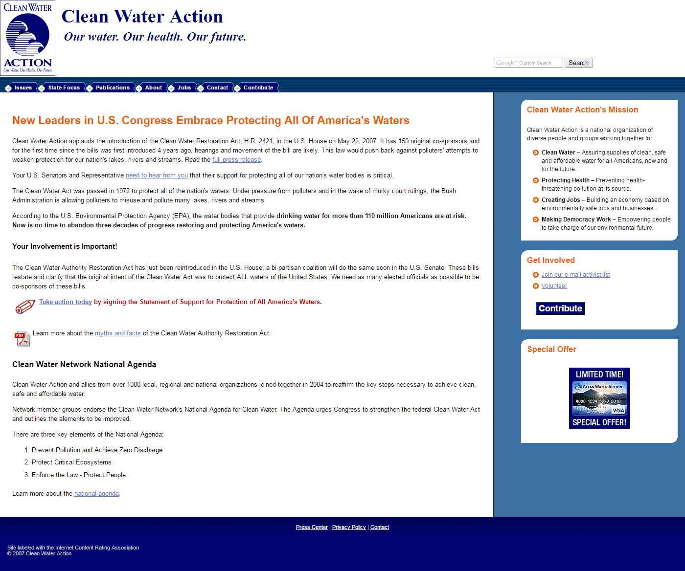 I looked at the organization’s branding, which used a logo developed in the early 1970s and a color scheme more suitable for print.
I suggested to senior leadership that this project would be a good time to do a visual rebrand.
They were skeptical. Many thought the old logo was fine, that it conveyed the organization’s history.
I knew we needed change. I had to convince them. But I’d never done an organizational rebranding before.
Approach
Many of Clean Water Action’s staff had been with the group for more than a decade. I knew feelings about the new look would run strong and deep.
Stakeholder research
I designed a survey for Clean Water Action’s staff. It included questions like:
- List five adjectives you would use now to describe Clean Water’s public image
- How do you want supporters and potential supporters to see Clean Water?
- How you think Clean Water’s current image matches how you want the group to be perceived?
I synthesized the results and found most staff members felt the logo and visual branding was out of date. It didn’t fit with the image they wanted the group to project.
SECURING BUY-IN
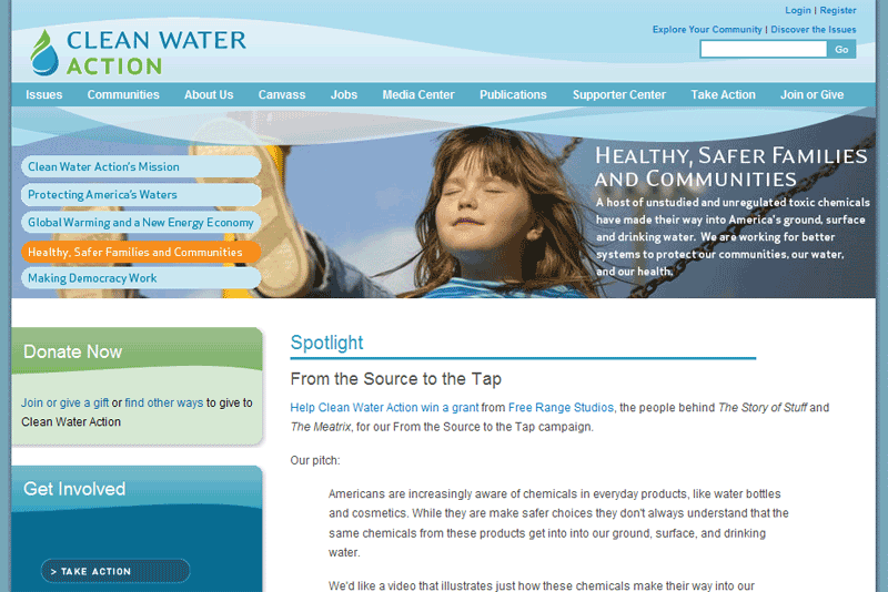 While most staff agreed the organization’s branding was out-of-date, Board members and senior managers with long tenures saw no reason to change.
I created a competitive research document and mood board illustrating the visual brands of groups similar to Clean Water. This direct comparison convinced senior leadership Clean Water needed a brand identity redesign.
This expanded the web redesign project from a site migration into a complete rebranding of Clean Water’s digital identity.
DESIGN, DEVELOPMENT, MIGRATION
State offices were eager to control their own content, but this complicated the content production and approval process.
It also exposed a need for more education about content strategy. State communications staff posting press releases on a state’s homepage wouldn’t achieve organizational goals.
I recommended Drupal for Clean Water’s new content management system (CMS). It would support a content approval process and enable the 501(c)3 and 501(c4) entities to share content.
The web design and development firm the Board chose offered Free Range Studios as a design partner.
Time constraints imposed by the Board meant visual rebranding would happen simultaneously to the site’s development and content migration.
There was no way I could do this alone.
BUILDING THE TEAM
I assembled a cross-functional, locality distributed team. It included staff members of varying tenures, ages, and responsibility areas to ensure the rebranding reflected all staff members’ concerns.
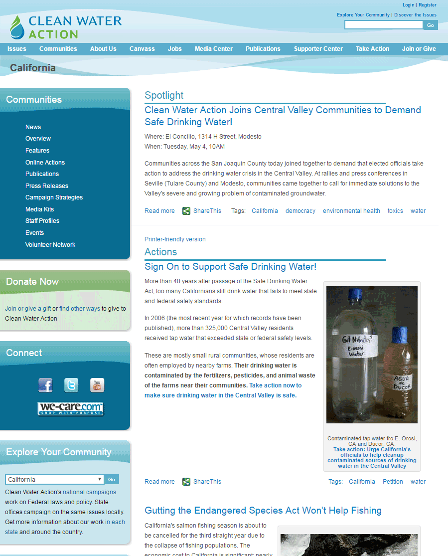 Parallel development processes meant managing the technical development firm, the visual design firm, and the internal approval processes at the same time. I had to keep each on track to avoid roadblocks for any single work stream.
I guided the internal and external teams through two rounds of wireframes and feedback for Clean Water Action and two rounds for Clean Water Fund.
Visual design included three initial homepage comps. It also included three rounds of revisions to the final design. Because mobile was not a factor in 2008, the team only had to consider desktop designs.
ORGANIZING THE SITE: IA & Content Strategy
Based on direct feedback from state offices, I deepened the Information Architecture I created when I standardized the organization’s flat HTML site.
A standardized secondary navigation within State sections provided a better user experience for site visitors, while the CMS build customized the content served by each menu item.
Migration
I created a phased plan that allowed Clean Water Action to publish the redesigned site with up to a year’s worth of content for each major section. I also created a plan for archiving content we did not port to the new CMS.
I recruited a separate team to help with content editing and migration.
DELIVERABLES
Rebranding included a double set of everything
- new logos for the 501(c)3 and 501(c)4 entities
- new color palettes for both
- new brand style guides
As of February 2021, Clean Water Action still uses the digital identity I built consensus for and guided through the approval process.
Other deliverables on this project included:
- competitive analysis and mood board
- staff survey on organizational perceptions
- survey analysis and recommendations
- determination and writing of technical requirements for CMS implementation
- recruitment and management of two separate cross-functional teams simultaneously
- revised Information Architecture structure providing state offices more flexibility
- content classification and migration plan
- editing and physical migration of content
After launching the site, I trained more than a dozen approved content creators in Clean Water Action’s various state offices. I also created a reference guide enabling those content creators to self-service when they needed help.
IMPACT
Clean Water Action staff in state offices had the power to post and manage their own content.
They had a clear content strategy which dealt with archiving and governance of stale content. And there was a standard process for getting state content featured on the site’s homepage.
The organization had a modern, digital-friendly logo, brand palette, and font stack.
 I did competitive research, which confirmed the IA Schroeder’s in-house team thought would be most useful to potential study participants.
 I looked at the organization’s branding, which used a logo developed in the early 1970s and a color scheme more suitable for print.
 While most staff agreed the organization’s branding was out-of-date, Board members and senior managers with long tenures saw no reason to change.
 Parallel development processes meant managing the technical development firm, the visual design firm, and the internal approval processes at the same time. I had to keep each on track to avoid roadblocks for any single work stream.