– My roles: Content Designer and Information Architect –
Challenge
The Blueprint Design System team had launched two releases in their SketchKit library. They’d clarified their rationale for their design language on the system’s website. And they’d provided pages of code for developers.
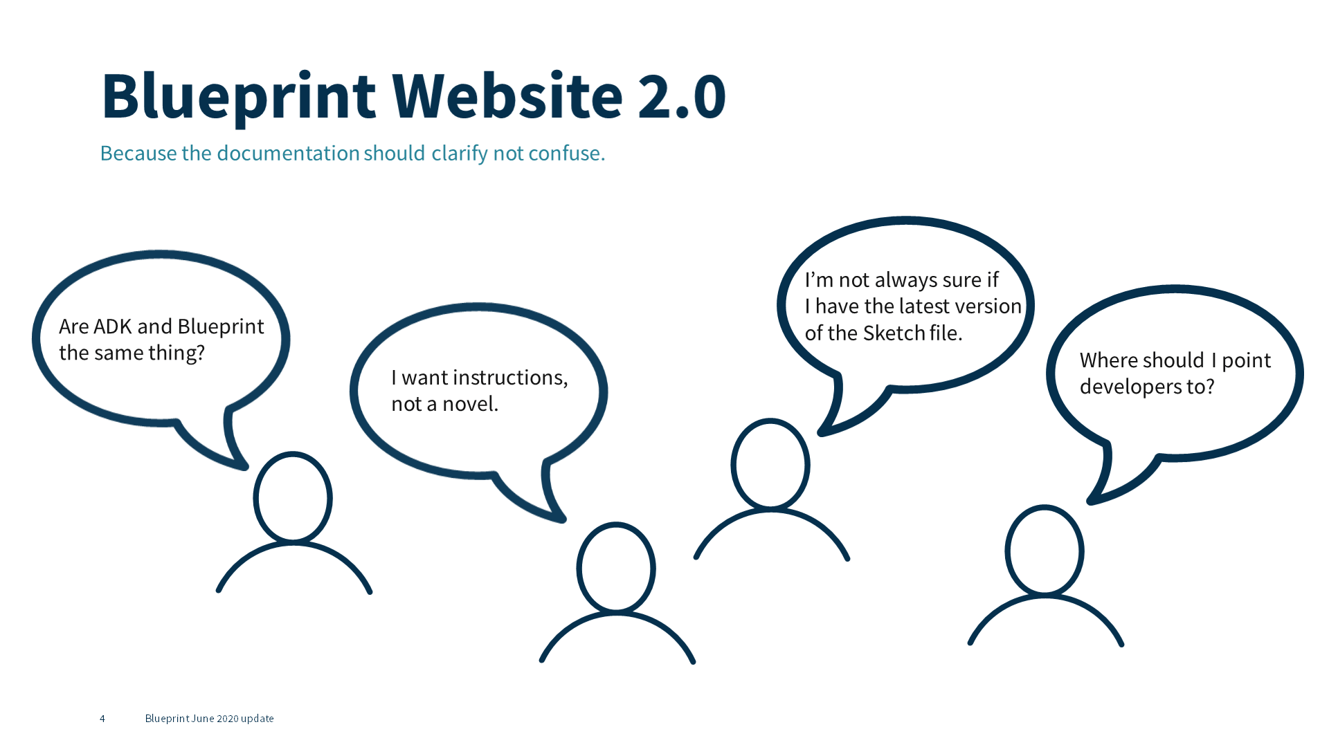
Yet designers in Fannie Mae’s Customer Experience Design (CXD) group struggled to understand how to use Blueprint’s components. They couldn’t seem to convince their development teams to use Blueprint’s code.
I noticed another set of challenges as I worked with Blueprint’s Product Owner to develop clear processes to govern Blueprint’s intake for new components, and to create a strategic roadmap for the design system’s maturity.
The website had no content strategy. And Blueprint’s documentation ignored the rules and principles in the writing guide I’d developed and pushed to have included in the design system.
I had to do something about Blueprint’s website if the design system wanted to get any traction inside Fannie Mae.
Approach
During interviews with CXD’s designers, I asked about Blueprint’s website.
 Every designer’s response was the equivalent of a verbal shrug. Some designers of the more than dozen we interviewed said they’d never looked at the Blueprint website.
The most common response: I don’t know where to look for what I need.
Behavior patterns & Content analysis
Light analysis of Google Analytics data supported what we heard in interviews. Visitors would bounce among the design language, guidance, and UI-toolkit sections of the site repeatedly before exiting.
I did a content analysis of the documentation on the site to see if the data were right.
I found content in those three sections was often redundant and confusing. Sometimes guidance for how to use a component existed in the design language section; other times it was on the component page.
Pages in the UI-toolkit section contained enough framing content to cause confusion. They were mostly code rendered examples of components and sections where developers could copy the code.
None of the component pages included any connection to the writing guide or the microcopy standards I and CXD’s Sr. UX Content Strategist had been promoting to CXD’s designers.
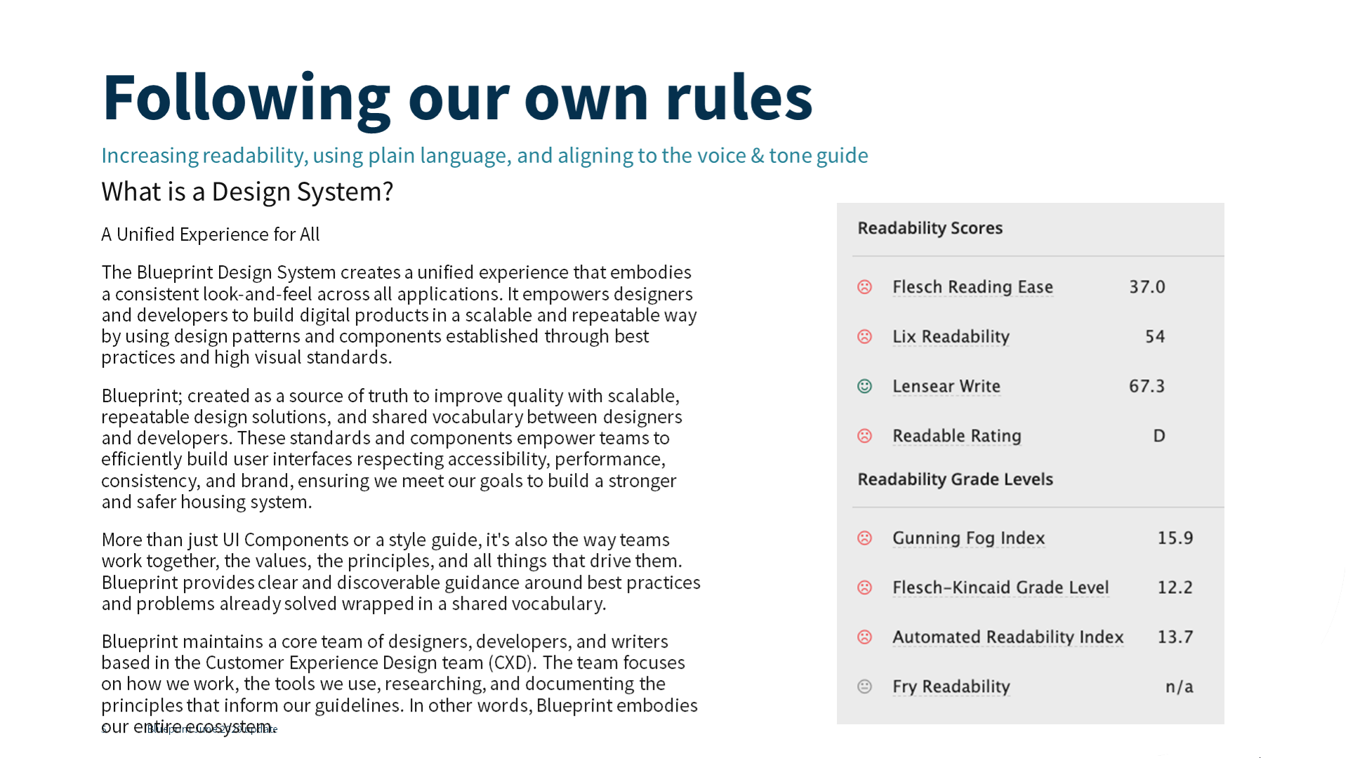
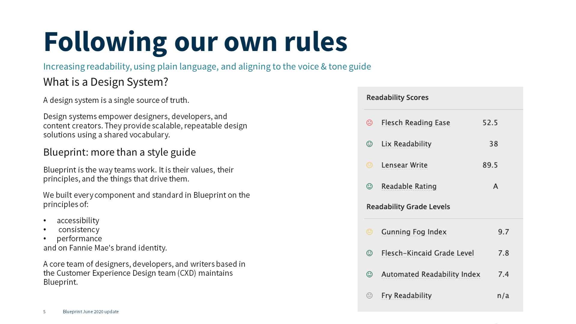
 I used readability scoring as a starting point. I’d need hard data to convince CXD’s leadership team that improving our documentation would help increase adoption for Blueprint.
Readability on most of the documentation scored way too difficult. This was especially true for component guidance.
Sometimes content stopped in the middle of a sentence then restarted a new sentence. Sentences were long, often end-loaded, and rarely used our own writing best practices.
I knew to improve the site the first thing we had to do was follow our own rules.
IA and content design
The interviews and Google Analytics data convinced me Blueprint’s site needed a new structure. The site also needed a different approach to how we presented content and code for components.
Convincing CXD’s leadership to focus on something besides code and components would be an additional challenge.
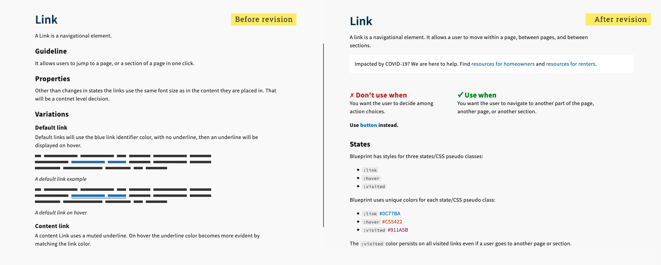
 I edited a sample of the text we planned to include on the revised Blueprint site. I wanted to show how applying the plain language, chunking, front-loading, and voice & tone principles included in Blueprint’s writing guide could improve the usability of our own site.
Components and the code that create them are Blueprint’s beating heart. I proposed a centralized approach to each component based on advice from Nathan Curtis.
Including design guidance, code rendered examples, copyable code, and UX writing guidance in a single place would make the component pages useful for 95% of Blueprint’s primary audiences.

The improved readability and my strategy for centralizing component documentation were enough to convince CXD’s Vice President. She understood that without good documentation, Blueprint wasn’t a design system as much as a disparate set of resources. She approved investing staff time to re-architect and revise Blueprint’s documentation.
I developed a new information architecture with input from a Design System Lead and the Sr. UX Content strategist in CXD.
We weren’t able to get CXD’s leadership to approve tree testing tools because of the lengthy software approval process at Fannie Mae. And we had a deadline of the end of June 2020 for our MVP website release.
We cobbled together a pseudo tree test using Mural. We asked a subset of the designers we’d interviewed to respond to the scenarios.
Our test results were solid enough that we felt we were on the right path. With additional input from Blueprint’s Product Owner, I settled on an IA for our MVP launch date and began revising content.

A key element of this new labeling was clearly indicating that design guidance and code would live together. “Design & Build” was an elegant solution with high information scent.
Writing the site
I first prioritized the evergreen content on the site. This included Blueprint’s:
- design language
- inspirational foundations
- connections to Fannie Mae’s brand standards
- commitment to accessibility
- principles of inclusive design
Much of the content included under design language I split out into the About Blueprint section.
Adding a Get Started section gave designers and developers a practical place to start with usable, basic concepts.
This approach created a clear path through the site for people unfamiliar with design systems. It also let people access the foundational content the original members of the Blueprint team valued.
I developed a process for prioritizing components based on the Google Analytics data and on the Product Owner’s preferences. Button was our first component.
The length, arduous process for software approval at Fannie Mae led the Blueprint team to use the 11ty static site generator as their content management system.
The contractor who had been running DevOps for Blueprint departed in Fall 2019. His approach to including code snippets in pages meant touching content pages when code changed.
As I revised the content on the site, I also systematized how the site was structured on the back-end, separating code into directories and using includes to pull it into documentation pages.
I set up a standard review process on a regular cadence. The Blueprint team worked in three week sprints. After the MVP release of the new site, Blueprint’s Product Owner and I agreed to monthly component documentation releases.
I provided revised documentation in a page priority template format that mirrored the structure on the Blueprint site. This reassured the Product Owner and any other reviewers that for the most part what they saw is what they would get.
Impact
As part of the Blueprint team, I released documentation revisions for nearly a dozen components in less than five months by the end of January 2021.
Designers reported in follow-up interviews that the revised component documentation was easier to understand. It also gave them a central place to send their product developers. Google Analytics reflected these reports showing site visitors had clear paths through the site.
We also saw increased interest in how Blueprint could help their product teams be more efficient from product owners in Fannie Mae’s business units.